Improving UI Aesthetics with Subtle Detail
Introduction
Often your interface is well-designed, modern, responsive, on par with industry standards. That’s fine.
But hidden within those polished components lies a silent weakness.
This weakness doesn’t break your design, it dulls it.
Take a walk through any template marketplace. Every offering looks high-quality, every layout clean, every component “production-ready.” Yet after a few dozen, they start to blur together.
Different color palettes, fonts, or corner radiuses can’t mask the sameness underneath.
This sameness is the hidden dagger of modern UI.
It doesn’t strike suddenly, it wears you down.
And as developers, if we aren’t careful, our own projects can fall into that swamp of generality.
To stand out, you must go beyond competence. You need to craft personality, micro-details so intentional that the design feels alive.
The kind that makes a user instinctively separate your work from everything else they’ve seen that day.
The Main and the Support
So how do you actually do that?
Start with restraint. Subtlety is your greatest weapon.
Like cooking, too much of any one ingredient spoils the dish.
A useful rule of thumb:
One main design choice that defines your visual identity, supported by a few subtle flourishes that quietly enhance it.
This principle extends far beyond web design.
You’ll find it everywhere, Breath of the Wild’s open landscapes balanced by soft ambient sound, or Apple’s hardware where every curve serves minimalist precision. The main idea dominates; the supporting details whisper around it.
Now, let me bring it closer to home, my own portfolio website.
Showing by Example
If you visit my site, you’ll notice something right away: it feels different.
Not necessarily better than others, but distinct, and, more importantly, memorable.
My main design choice is a parallax effect: as you move your mouse, components subtly react, shifting at varying speeds to simulate depth. The motion feels organic, giving the page quiet life without distracting from its content.
This was done using a wonderful React tool by choozn.
The effect introduces a soft layer of interactivity, your cursor becomes part of the environment, not just a pointer.
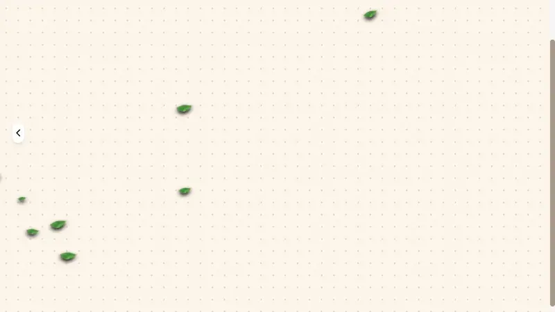
Then come the supporting details: a dotted background and falling leaves.
They’re simple. If removed, the layout still works, but with them, it breathes.
Together they add texture, warmth, and personality.
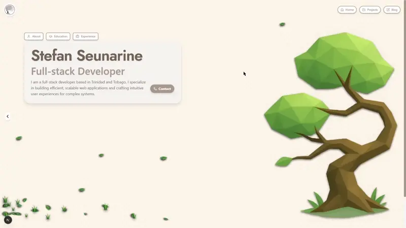
The Dotted Background
This one was absurdly simple to implement, five lines of CSS:
.dotted-background {
    background-color: #fcf5e8;
    background-image: radial-gradient(rgba(158, 140, 122, 0.329) 1.5px, transparent 1.5px);
    background-size: 24px 24px;
}
That’s it.
A soft, paper-like texture that subtly breaks flat monotony. It doesn’t distract, it simply makes the page feel more tactile.
It’s amazing how much “life” five lines of CSS can add.
(A special thanks to ChatGPT for that one, my five-line miracle.)
The Falling Leaves
This one took much longer to perfect,but it’s easily my favorite detail.
I wanted the page to feel alive, like nature itself flowed through the background. But to pull that off, the animation couldn’t feel mechanical. Each leaf needed its own rhythm, its own personality.
Different speeds, sizes, and delays, drifting naturally across the viewport.
After several iterations, I ended up with two key animations:
@keyframes leaf-drift {
  0%   { transform: translate3d(0, 0, 0); opacity: 0; }
  8%   { opacity: 1; }
  80%  { transform: translate3d(-110vw, 80vh, 0); opacity: 0.8; }
  100% { transform: translate3d(-110vw, 80vh, 0); opacity: 0; }
}

@keyframes leaf-sway {
  0%, 50%, 100% { transform: translateX(0) rotate(0deg); }
  25%  { transform: translateX(0.6vw) rotate(12deg); }
  75%  { transform: translateX(-0.6vw) rotate(-12deg); }
}

.leaf-parent {
  position: absolute;
  right: var(--start-right, 15vw);
  top: var(--start-top, 5vh);
  width: var(--size, 28px);
  opacity: 0;
  pointer-events: none;
  animation: leaf-drift var(--duration, 10s) linear var(--delay, 0s) infinite;
  will-change: transform, opacity;
}

.leaf-child {
  width: 100%;
  animation: leaf-sway var(--sway, 3.2s) ease-in-out infinite;
  transform-origin: 50% 50%;
}
Each leaf’s animation is governed by CSS variables.
That means I can dynamically control properties like duration, size, and delay in JavaScript, creating hundreds of leaves, each with a slightly different trajectory.
To make it efficient, I pre-generated random values for each leaf and stored them in a JSON file:
[
  { "id": 0, "size": 20, "duration": 9.4, "delay": 3.4, "startTop": -4.5, "sway": 3.0 },
  { "id": 1, "size": 41, "duration": 14.3, "delay": 4.4, "startTop": 16.0, "sway": 3.4 },
  { "id": 2, "size": 38, "duration": 9.3, "delay": 5.8, "startTop": 26.5, "sway": 3.4 }
]
This avoids recalculating random values on every page load and keeps animations consistent, improving both performance and perceived polish.
Together, the dotted background and falling leaves don’t dominate the screen, they enrich it.
Their purpose isn’t to be noticed; it’s to be felt.
The Takeaway
Improving your UI isn’t always about adopting a new framework or following the latest Dribbble trend.
It’s about intentional nuance, details that don’t scream but sing softly in the background.
Start with one defining element that gives your interface its soul.
Then, surround it with subtle touches that reinforce it, never compete.
When done right, users won’t just see your design, they’ll remember how it felt.
Because subtle detail, when handled with care, isn’t decoration.
It’s storytelling.
Note: While this was written completely by me it was formatted and corrected utilizing AI
Written by Stefan Seunarine — Developer, Designer, and Builder of things both functional and beautiful.